Linen Postcards of Vermont and New Hampshire
America, Retouched and Reimagined
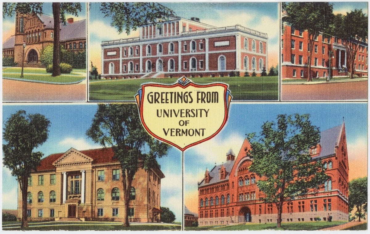
This week’s puzzle: Greetings from UVM
I’ve always love these linen postcards. They seem to evoke a special world, in the manner of Maxfield Parish.
I was curious about their history, and you might be curious about what ChatGPT wrote, supposedly emulating my “Curioustorian style.” Love to hear your thoughts.
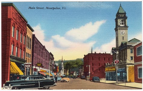
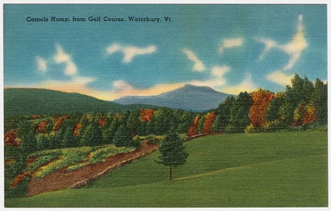
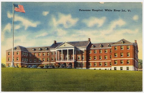
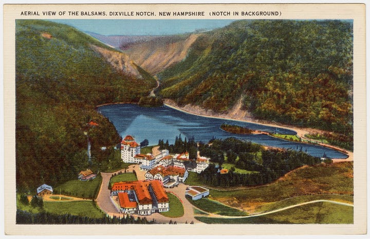
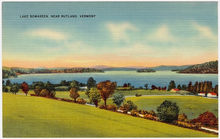
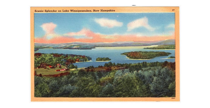
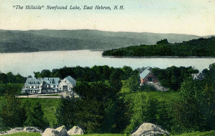
”Between the early 1930s and the mid-1950s, America’s mailboxes filled with a new kind of color view card. Printed on a lightly textured paper that looked and felt like fabric, these linen postcards used bold inks and new offset-lithography techniques to make every sky bluer, every lawn greener, and every town a little prouder of itself.
The look came largely from Curt Teich & Company of Chicago, the industry’s powerhouse printer. Their process—called “Art-Colortone”—used retouched black-and-white photographs overlaid with vivid, hand-tinted colors. Teich’s studio artists quietly removed telephone wires, straightened buildings, and added idealized trees or cars until each scene felt both real and dreamlike.
From resort lakes to state capitols, linen cards became miniature posters of optimism, capturing an America intent on recovery and progress during the Depression and wartime years. By the 1950s, shiny chrome postcards began to replace them, but the linens remain instantly recognizable for their texture and surreal glow—half photograph, half promise.”
🔗 Explore further:
Boston Public Library – Curt Teich / Tichnor Brothers Collection
Smithsonian Magazine – The Golden Age of Postcards
Why they feel “surreal” or “magical future” to us today:
Hyper-saturated skies – always impossibly blue, dotted with puffy “storybook” clouds.
Glowing buildings – whites made extra bright, brickwork clean, no weathering or soot.
Dreamlike cars/people – colorful autos scattered like toys, usually just a few well-placed figures to suggest bustle without mess.
Retouched landscapes – extra trees, vivid lawns, flowers where reality was more modest.
Aspirational urbanism – theatres, factories, and main streets shown as thriving, modern, optimistic.
It’s almost a New Deal / midcentury boosterism style:
They were meant to sell a town, a building, a vacation destination — often exaggerating its charm or modernity.
Curt Teich, the biggest publisher, was very open about retouching: their motto was essentially “show it better than it is.”
To people in the 1930s–40s, these images were like windows into progress and prosperity — the “future they hoped for.”
Thanks for reading.Cameron Cross
The Curioustorian


